Here are some of the examples we found..


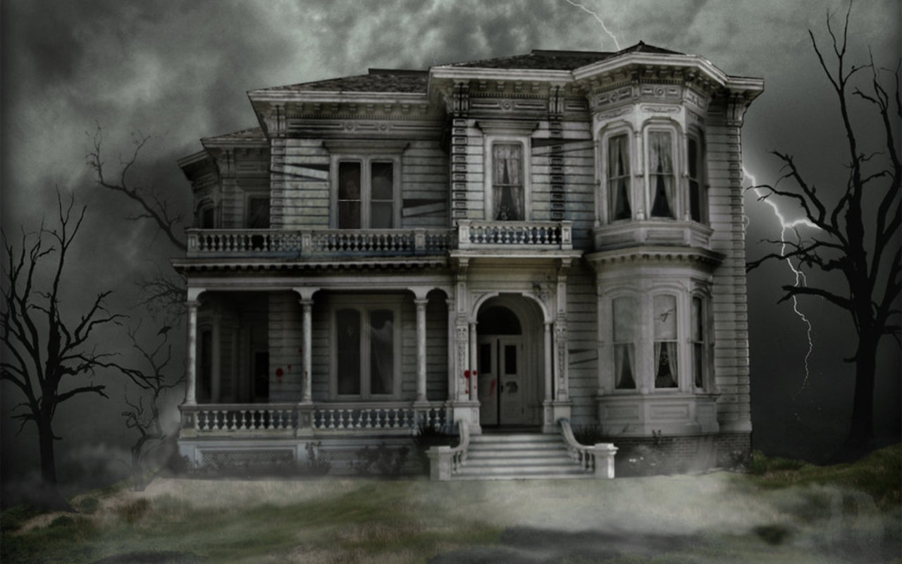

 Although relevant to our storyline and genre, we found theses images too realistic and detailed for the poster, especially since these house shapes aren't at all similar to the actual house we filmed. So we decided to look at the idea of a silhouette due to its simplicity and eerie feel, also how it would just symbolise the haunted house rather then try to replicate it.
We settled on this idea, as we also found the simplicity wouldn't draw attention away from the more important parts of the poster, such as the title. However, it would also stand out just the perfect amount due to its bold and blocky shapes.
It has been edited using Photoshop by removing the colours as we thought it would be more effective black and white.
No comments:
Post a Comment