Poster Inspirations
The next step to creating our poster was to look at examples of current film posters for inspiration and ideas on how to create our own.
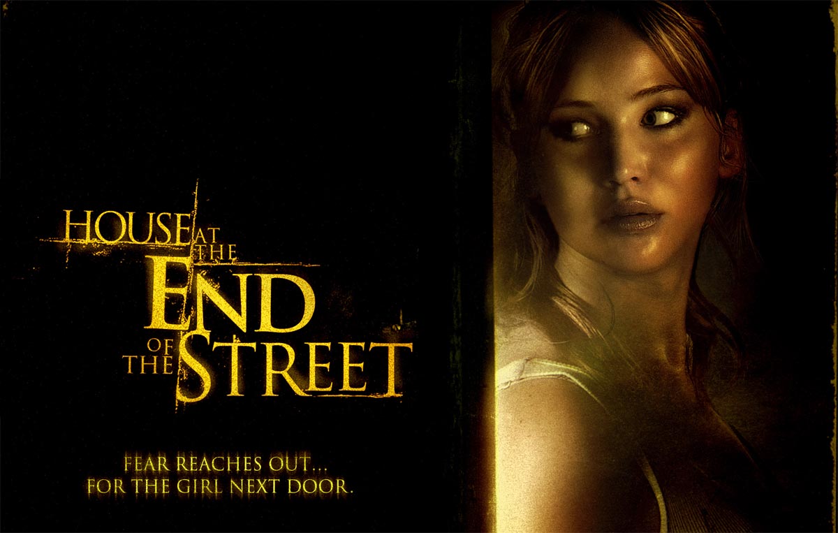
We loved this poster for recent release, 'The House at the End of the Street', because of the use of colour. This is because only two main colours are used, black and yellow, this is effective as the yellow used for the title and the yellow tones used in the image 'jump out' against the pitch black background. Giving across a simplistic yet eerie feel and showing clearly the horror genre of the film.

The next poster we went to for inspiration was the well known 'paranormal Activity', films, choosing the most recent release. This poster also shows typical aspects of a horror poster while also staying to the design of two main colours while strongly linking to the paranormal theme with blue, giving off a isolated and icey tone. However what inspired from this poster and made us realise in the previous, is the use composition as the girl is lying horizontal as is the date in the bottom left corner, the title, the taglines. Everything except the dark figure, emphasising the it and how it is out of place and not supposed to be there. Additionally wanting to draw the attention of the audience.
No comments:
Post a Comment